Coloring Event Images
Hey folks!
It’s been forever since I did a blog; I really tend to be the kind of person who likes to wait until I’m done with something before showing off what I’ve created, but today I suppose I can give you another peek behind the scenes. This time around, I’ll show you a bit of the process we’re using for event images.
Event images have been one of the last big hurdles for us to get through in completing Errant Heart. Unlike the sprites and backgrounds that get a lot of use throughout the visual novel, event images only show up briefly to punch up important moments in the story. They’re a lot of work for something that will only be on screen for a moment or two, but the effect they have is worth it.
In order to get through the creation of all these images, I’ve been trying to streamline the process a little with with a new coloring method.
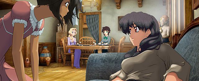
This sample is one you’ve likely seen in one of our Kickstarter updates, but it was a bit more involved than most, and makes for a more interesting example.
So here’s my quick sketch based on Ron’s description of the scene: Lira on the couch in the living area above the flower shop, with Salima attending to her and Eva and Noel seated at the table in the background.

This mostly served as a placeholder image, as I had no idea what the room was going to look like until it was put together by Owen.
This is the render we got from Owen. The arrangement of the furniture wasn’t what I was expecting, and forced me to rethink my composition—ultimately making me put together something that was more interesting than my first impulse.

With a little help from 3D software, I approximated the layout of the room, and found an angle that I thought would work.

Using the makeshift background, I made a new sketch that would better represent the final image.

I showed Owen my sample, let him know what I had in mind, and he managed to provide another render at the perfect angle.

After that, all that was left was to finalize my sketch, and send it over to Ron for “ink and tone.”
This is an odd part of the process that’s been left over from our time working with black and white screen toned comics. I’ve managed to adapt it to something that works well enough as a coloring method by turning the tone layers into masks for colors.

Rather than using a straight up cel-style look, I use the smudge brush in Photoshop to blend both of the shadow layers a bit here and there to make things a little more interesting.


And this is the part where it all starts to come together. I create “flats” of each area that needs to be a different color. So one for hair, skin, etc. Each one gets filled with a base color.


Once I’ve done that, I use those flats as a selection to cut out the overlapping portion of the shadows, which I then fill with the appropriate shadow color.


I do this for each area. It’s tedious, but faster than some of the alternatives.

Once all of the basic coloring is done, it’s time for some quick touch-up work. This consists of a little bit of airbrushing in some extra shadows and highlights, as well as coloring the line art to give it a more finished look.

And, viola! I mean, voilà! I just repeat this process for every important moment in the story, and we’ve got Errant Heart in no time!?
Hope you enjoyed this little look into the creation of our project. Thanks for reading!
-Mike


0 comments