There’s no trick to it—it’s just a simple trick!
I wanted to take a few minutes to reflect on an incredibly simple trick that I just implemented in Errant Heart, which I find endlessly amusing.
At the outset of this whole visual novel endeavor we wanted to leverage our experience in animation and comics. And that is to say, we really wanted Errant Heart to be a visually stimulating experience. Of course, that’s easier said than done and has the potential to end up at either end of the extremes—too boring or too distracting/gimmicky.
Some might look to such a task and decide to focus on generating a boatload of special event images. And sure enough, an event image every few minutes would certainly keep up visual interest. It would also result in requiring far more resources and grind everything to a halt (um, more-so).
So we’ve been doing what we can to balance the needs of visual interest and minimal resources. And that has taken many forms—custom menus, image transitions, “paper doll” sprites with multiple poses, expressions, outfits, hair styles, custom in-engine lighting changes and effects, lots of (outsourced) backgrounds with multiple times of day, etc.
In any event, there was a spot near the beginning of the game which was a little devoid of visual interest. It’s just Lira on a boat, thinking to herself. The monologue is important as it’s the reader’s first glimpse at how the protagonist thinks. That baseline serves as an important metric—it will allow readers to understand how Lira evolves as a character later.
Still, was there anything we could do to ratchet up the visual interest during the segment? Well, the character is riding on a boat. And what do boats do? Sink? Um, well, yes, but more commonly, they ply the waters effortlessly—bobbing up and down as they go. Below is what we came up with:
It’s subtle, but I think it’s something that most people wouldn’t expect to see normally. Just separate the background and foreground, add in a little repeating motion in the code and voila!
Okay, okay, on it’s own this is nothing to write home about. But we’ve done our best to implement little touches like this throughout the game to help keep up visual stimulation without seeming too repetitive or distracting. Hopefully it all adds up into a satisfying reading experience.
System Building
In my last post, I talked a bit about how we decided to give visual novels a try since the more text-heavy approach provided us with a chance to tell more story than we’d be able to in other media. But even with the focus on more written story, we still want to make the visual part of the visual novel as interesting as possible.
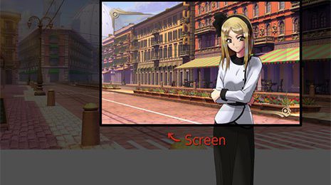
Something I noticed in a lot of the visual novels I’ve seen, is that they tend to stick with a very specific layout for their entirety. It’s usually something along the lines of this:

A background that fits the screen, a medium shot of a character (or two) in the center, the text box and…well, that’s pretty much it. This approach struck me as a little boring, and given the flexibility provided by the RenPy engine, completely unnecessary.
RenPy can pan, scale, zoom, rotate (and more!) pretty much every element in the visual novel, so from the start, we made sure to design Errant Heart with larger backgrounds and character sprites in order to take advantage.


Also, since we’re primarily representing our characters through sprites (with the occasional special image for major story points), we wanted to do our best to keep them from feeling too static. This meant adding as many variations to expressions, poses and costumes as we could.
Of course, since we were planning for this to be a reasonably long visual novel, I wanted to make it as easy as possible for Ron to “direct” each scene, so I wound up putting together a few systems to make it easier to pick the desired version of the sprite, place the characters, keep them at the proper height relative to each other and so on.
Paper Dolls
We wanted to do a lot with our characters, but rather than include hundreds of individual images for each possible variation, we opted for making them modular; Most characters have a number of poses to chose from, each with its respective expressions, costumes, and even color tints that help them to mesh better with the backgrounds (many of which change with time of day).

The required costume and tinting are specified at the beginning of a scene, so all the director needs to do afterward is specify which expression/pose is desired, and place it in the scene.
Positioning
After being bothered by some visual novels where shorter characters were apparently floating off of the ground in order to stand next to another…

…I decided to create some predefined positions that would make it easy to place characters appropriately, without forcing the audience to imagine one of them standing on an unseen stool, or in a deep hole. These positions also make use of scaling to help create the illusion of distance from the “camera” when needed.

These are just a few of the details we’ve focused on in the hopes of making Errant Heart the most enjoyable novel experience it can be. Thanks for taking the time to read this “behind-the-scenes” look at our project, and please be sure to let people know about our Kickstarter, going on right now!


